
Bold colours don’t need defending.
They just need good design around them.
Bold colour has a reputation problem.
Say “lime green” or “bright blue” and people instinctively recoil. Too loud. Too risky. Too much. And often, the colour gets blamed when a space doesn’t work.
But more often than not, it’s not the colour that’s wrong.
It’s the lack of context around it.
Why bold colours get such a bad name
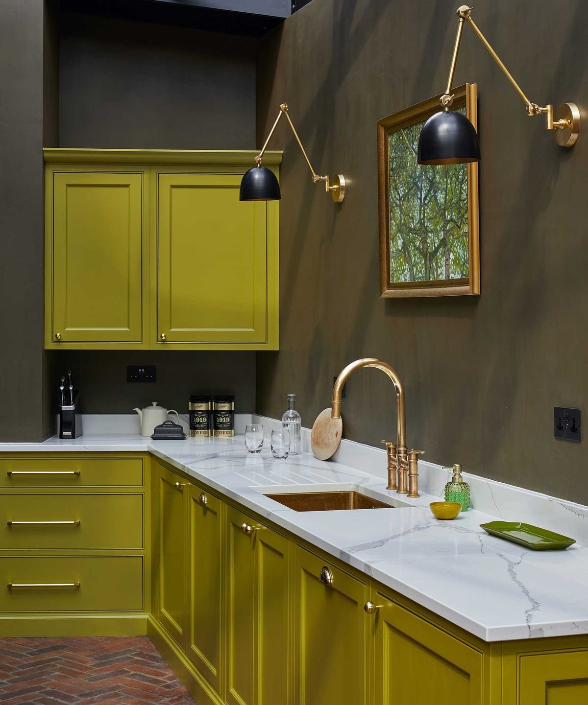
Most of us have seen bold colours used badly. A feature wall with no connection to the rest of the room. A bright kitchen dropped into an otherwise neutral space with nothing to anchor it. A colour chosen in isolation, without considering light, materials or how the room is actually used.
When a colour feels overwhelming, it’s usually because it’s doing too much work on its own.
Context changes everything
A bold colour needs support. It needs something to push against.
This is where good design comes in — pairing, grounding and restraint.
Think:
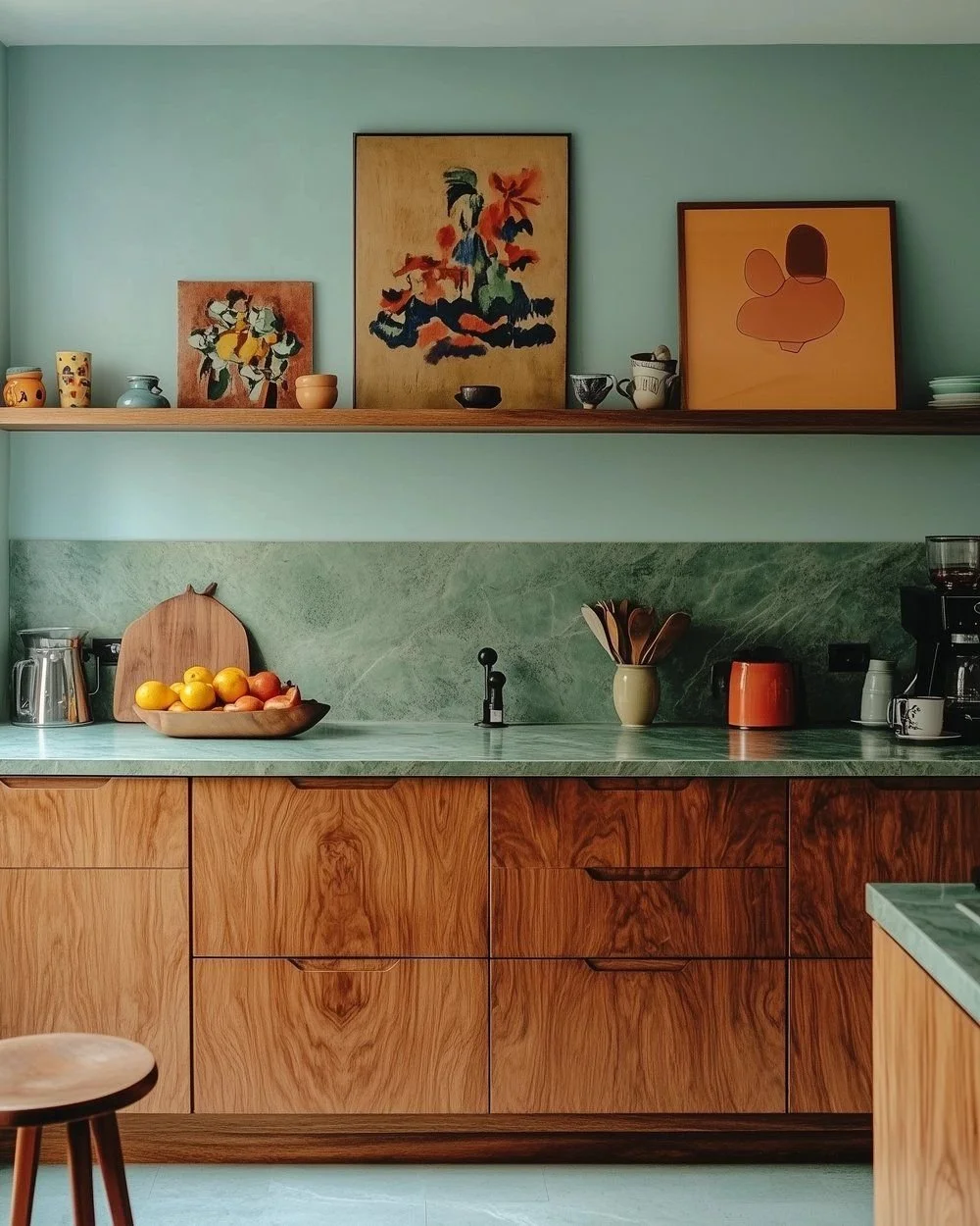
– deeper or dirtier tones to balance the brightness
– natural materials like timber, stone or linen to soften the edge
– black, bronze or darker metals to add contrast and weight
– repeating the colour in smaller, quieter ways so it feels intentional
When a bold colour is part of a considered palette, it stops shouting and starts contributing.
Why balance matters
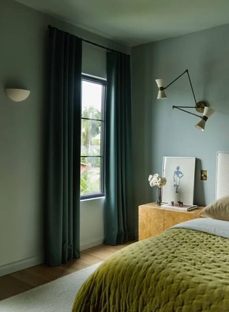
This is the part that often gets missed. Bold colour doesn’t need to stand alone — it needs to be paired well.
A strong colour works best when it’s balanced by another tone that lets it sing without shouting. One that softens it, grounds it or gives it somewhere to land.
Think lime green paired with a dusty sage, or the right olive. The brightness is still there, but it’s tempered. The colour feels intentional, not overpowering.
Good colour pairings create harmony. They allow bold shades to feel considered and livable. Not loud for the sake of it.
Balance isn’t about playing it safe. It’s about understanding how colours interact, and choosing combinations that feel resolved rather than reactive.
Giving colour a job
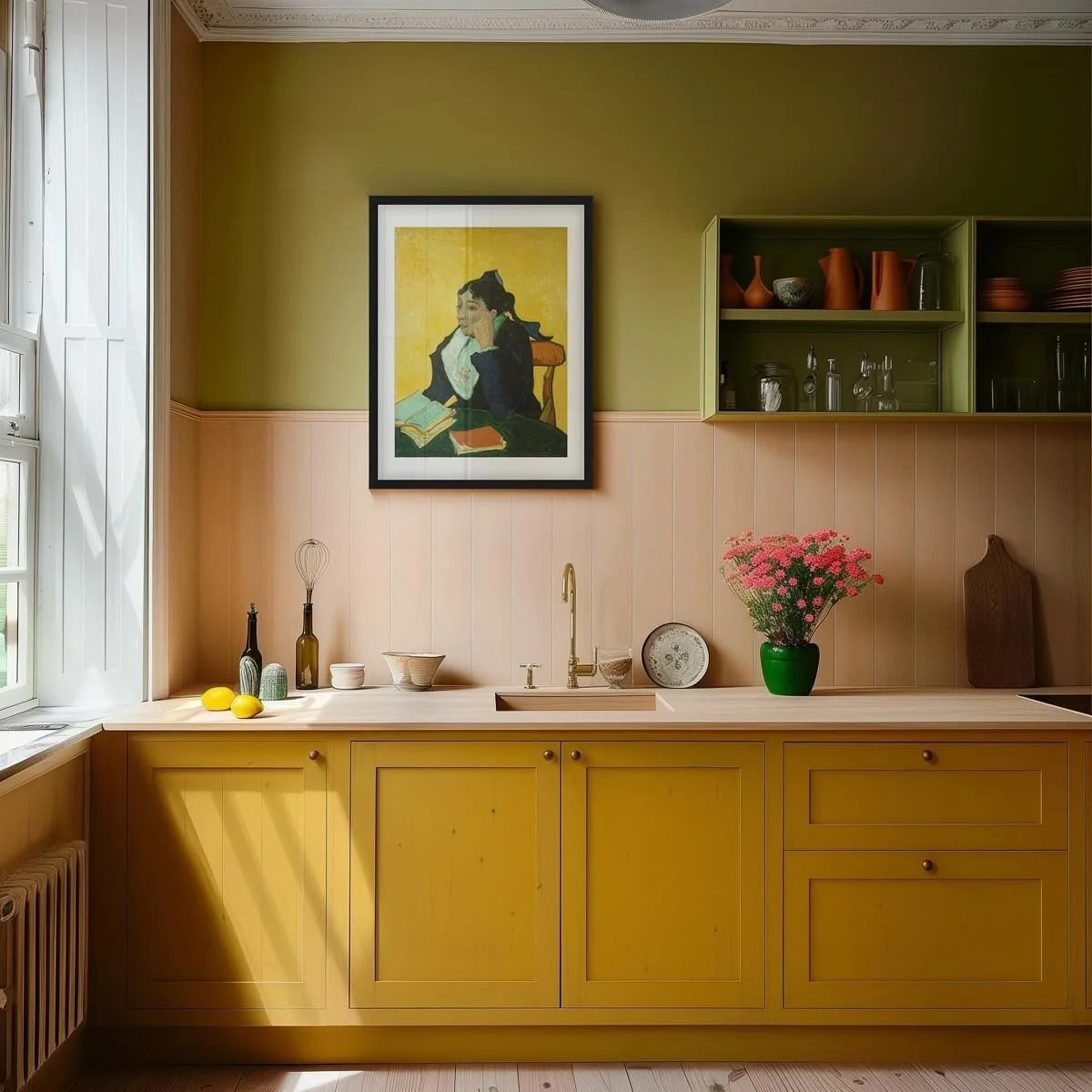
One of the easiest ways to make a bold colour work is to give it a role.
Is it:
– highlighting a functional element (cabinetry, joinery, a cupboard)?
– energising a small space (powder rooms are brilliant for this)?
– adding depth rather than decoration?
When colour has a purpose, it feels deliberate. It becomes part of the architecture of the space, not just an afterthought.
Bold doesn’t mean careless
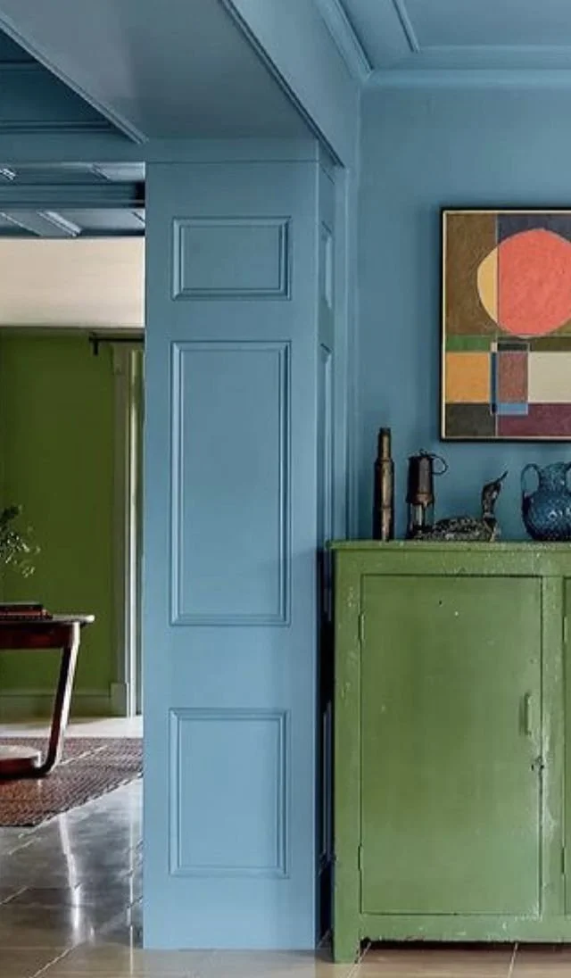
Using bold colour isn’t just about how much you use. It’s about what’s supporting it.
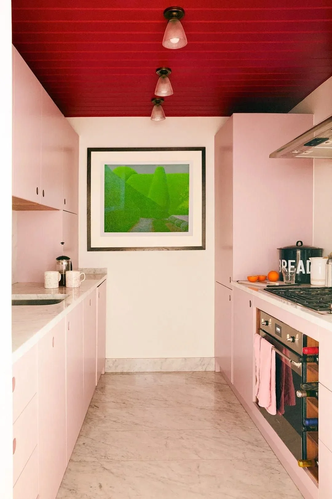
Sometimes restraint is the answer. Other times, covering every surface can actually make a bold colour feel calmer and more resolved. Colour-drenched rooms can work beautifully when finishes, textures and furnishings are doing the balancing.
The key question isn’t where do I stop?
It’s what’s holding the colour up?
Thoughtful pairings, considered materials and tonal balance allow bold colour to feel intentional. Whether it appears as a single joinery moment, a confident tile choice or wrapped across walls, ceilings and cabinetry.
Bold works when the surrounding elements know their role.
The takeaway
If a bold colour isn’t working, don’t ask whether the colour is wrong.
Ask:
– What’s supporting it?
– What’s balancing it?
– How does it relate to the rest of the palette and materials?
When colour is layered thoughtfully and placed with intention, it doesn’t feel risky. It feels resolved.
Bold colours don’t need defending.
They just need good design around them.